If you’ve been following interior design trends over the last few years, you have undoubtedly encountered “Japandi.”
A hybrid of Scandinavian functionalism and Japanese rustic minimalism, this style has taken the world by storm. It offers the perfect balance of comfort (“Hygge”) and mindful simplicity. But as an artist looking at many Japandi spaces online, I often notice one thing: they are beautiful, but sometimes they feel… incomplete. They are perfectly styled showrooms, waiting for a soul.
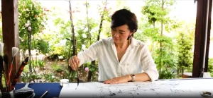
We believe that the “soul” that completes a Japandi room is Japanese Calligraphy Art (“Sho”). In this guide, we explore why ink and brush are the natural partners for this beloved aesthetic.
Where Nordic calm meets Japanese depth.
1. The Shared DNA: Wabi-Sabi Meets Hygge
Why do Scandinavian and Japanese designs blend so seamlessly, despite being oceans apart? Because they share core values:
- Love of Natural Materials: Both prioritize wood, stone, linen, and paper.
- Appreciation for Simplicity: De-cluttering to find peace.
- Embracing Imperfection: This is crucial. The Japanese concept of “Wabi-Sabi” finds beauty in things that are imperfect, impermanent, and incomplete.
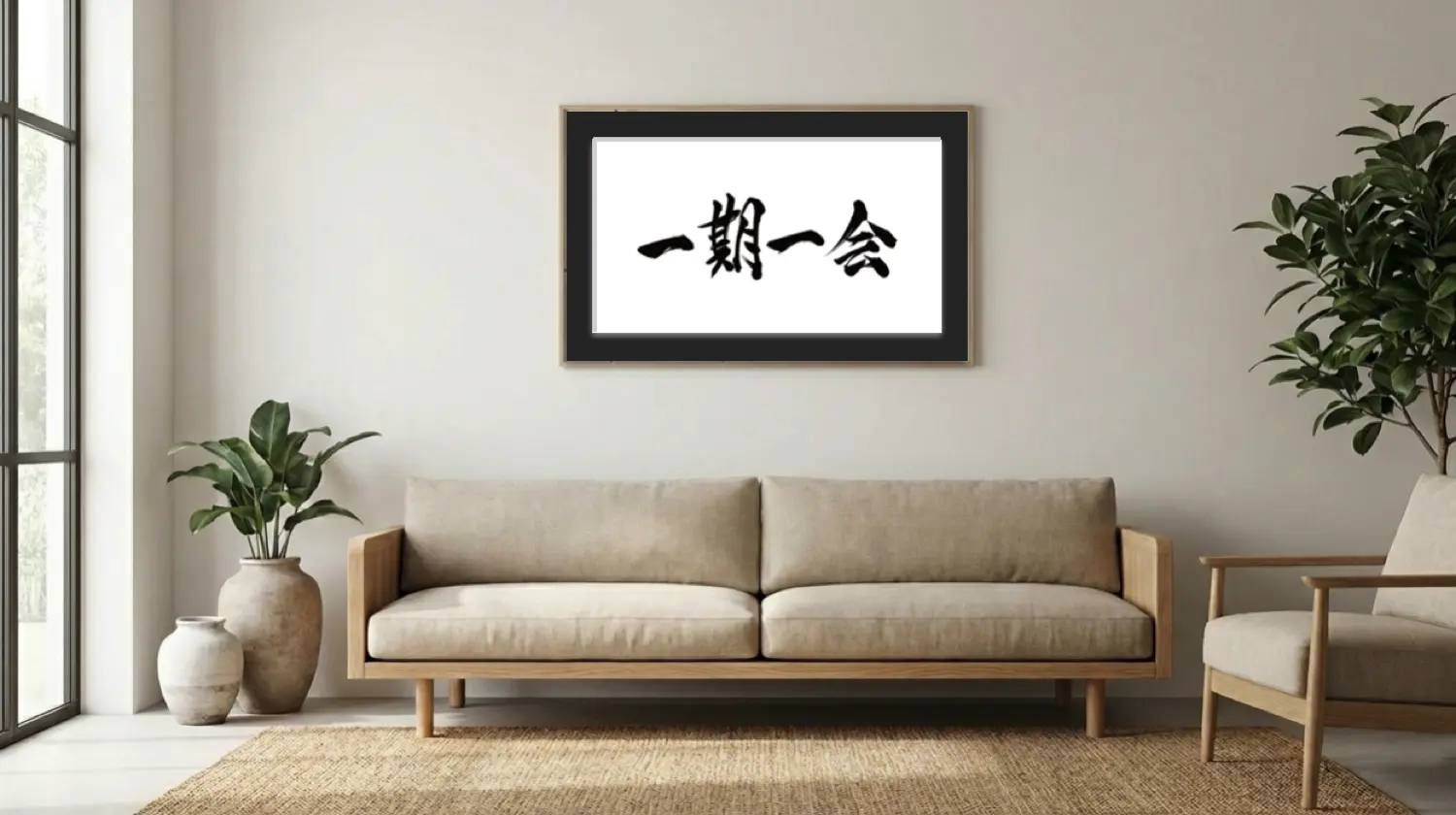
A modern Scandi sofa can sometimes feel too perfect in its clean lines. A piece of hand-brushed Sho, with its unpredictable ink splashes, natural bleeds (nijimi), and textured Washi paper, introduces that essential Wabi-Sabi element. It breaks the rigidity and adds organic warmth.
2. Styling Sho in Japandi: The “Less is More” Approach
Japandi is a minimalist style. Therefore, the art must respect the “Ma” (Negative Space).
Recommended Art Styles
Avoid busy, traditional calligraphy scripts that might feel too “heavy” or old-fashioned. Instead, opt for:
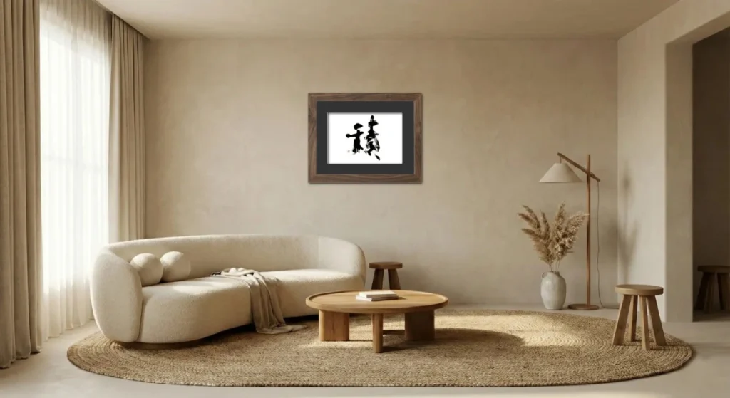
- Abstract “Bokushou”: Dynamic, non-legible ink expressions that focus on energy and form.
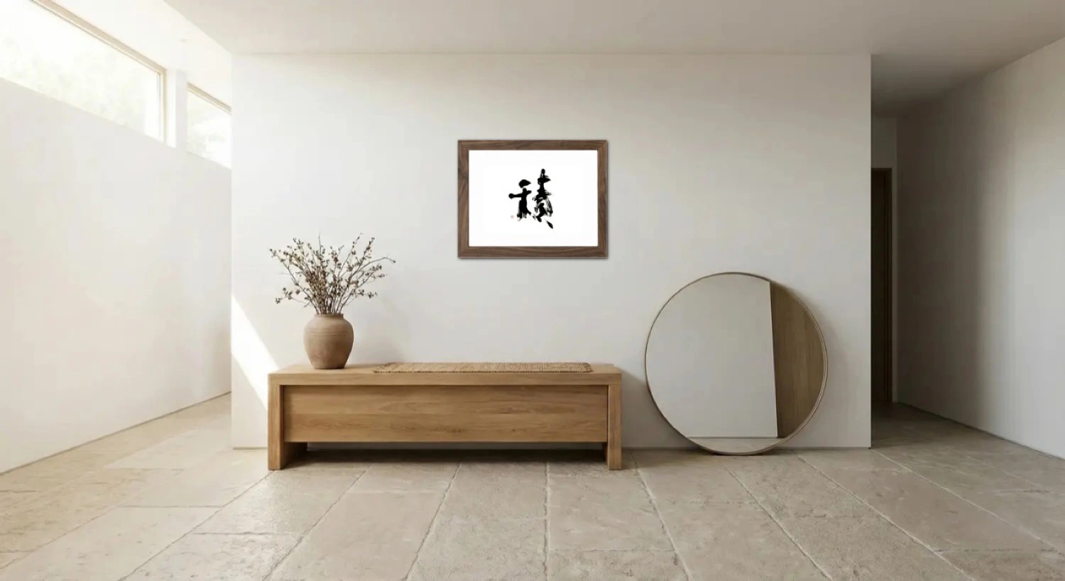
- Personalized “Words” or the “Enso”: The “Enso” (Zen Circle) is a beloved symbol of Japandi, and we are happy to create one upon request. However, Yabe Chosho’s true specialty lies in giving form to the “Words” that matter to you. Whether it is “Harmony” (和) or “Dream” (夢), commissioning a bespoke piece based on your personal philosophy is the ultimate way to bring a unique soul to your space.
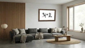
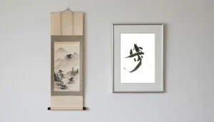
- Minimalist Characters: A single, meaningful kanji written with ample white space around it.
The Enso circle: The ultimate symbol of simplicity and completeness.
Framing and Materials
The frame is just as important as the art. To maintain the Japandi aesthetic:
- Wood Tones: Choose thin frames in light oak, ash, or maple to match your furniture.
- Matte Finish: Avoid glossy frames or highly reflective glass. The textures of the ink and Washi paper should be the star.
3. Creating a Moment of Stillness
Ultimately, the goal of a Japandi home is to create a sanctuary—a place to slow down. A printed poster on the wall is just decoration. But original ink art carries the concentrated energy of the artist’s moment of creation. When you gaze at it, it invites you to pause and breathe.
Complete Your Japandi Sanctuary
Is your room missing its soul? Don’t guess what fits.
Upload a photo of your space to our simulator and see how a genuine Enso or abstract Sho piece brings the entire room together.
ジャパンディ(Japandi)に足りない最後のピース:「書」が完成させる北欧×和のミニマリズム
ここ数年のインテリアトレンドを追っている方なら、間違いなく「ジャパンディ(Japandi)」という言葉を耳にしたことがあるでしょう。
北欧の機能主義と、日本の素朴なミニマリズムのハイブリッドであるこのスタイルは、世界を席巻しました。それは快適さ(ヒュッゲ)と、マインドフルな単純さの完璧なバランスを提供します。しかし、アーティストとしてネット上の多くのジャパンディ空間を見ていると、あることに気づきます。それらは美しいのですが、時として「未完成」に感じるのです。完璧にスタイリングされたショールームのようで、そこには「魂」が待たれています。
私たちは、ジャパンディの部屋を完成させるその「魂」こそが、日本の書道アート(Sho)であると確信しています。このガイドでは、なぜ墨と筆が、この愛される美学の自然なパートナーであるのかを解説します。

北欧の静けさと、日本の深みが出会う場所。
1. 共有されたDNA:侘び寂びとヒュッゲの出会い
なぜ、海を隔てた北欧と日本のデザインがこれほどまでにシームレスに融合するのでしょうか? それは、核となる価値観を共有しているからです。
- 自然素材への愛:どちらも木、石、リネン、紙を大切にします。
- 単純さの尊重:安らぎを見つけるために、不要なものを削ぎ落とします。
- 不完全さの受容:これが極めて重要です。日本の「侘び寂び」の概念は、不完全なもの、移ろいゆくもの、未完成なものの中に美を見出します。
モダンな北欧ソファのクリーンなラインは、時に完璧すぎると感じることがあります。そこに、予測不可能な墨の飛沫、自然な滲み(にじみ)、そして和紙の質感を持つ「肉筆の書」が加わることで、不可欠な「侘び寂び」の要素が導入されます。それが硬直さを打ち破り、有機的な温かみを加えるのです。
2. ジャパンディにおける書のスタイリング:「Less is More」
ジャパンディはミニマリストのスタイルです。したがって、アートは「間(余白)」を尊重しなければなりません。
おすすめのアートスタイル
「重すぎる」あるいは古臭く感じるような、伝統的で込み入った書体は避けましょう。代わりに、以下のようなスタイルを選びます。
- 抽象的な「墨象」:エネルギーとフォルムに焦点を当てた、読むことを目的としないダイナミックな表現。
- 「円相」(Zen Circle):おそらくジャパンディにとって最も完璧なシンボルです。悟り、空(くう)、完全性を表す、たった一つの不完全な円。その曲線的なフォルムは、家具の直線的なラインを和らげます。
- ミニマルな文字:周囲に十分な余白を持たせて書かれた、意味のある漢字一文字。
円相:単純さと完全性の究極のシンボル。
額装と素材
フレームはアートと同じくらい重要です。ジャパンディの美学を維持するために、以下の点に注意してください。
- 木のトーン:家具に合わせて、ライトオーク、アッシュ、メープルなどの薄い色の細いフレームを選びます。
- マット仕上げ:光沢のあるフレームや、反射の強いガラスは避けてください。墨と和紙のテクスチャが主役になるようにします。
3. 静寂の瞬間を創り出す
最終的に、ジャパンディホームの目標は、聖域――ペースを落とすための場所――を作ることです。壁に貼られたプリントポスターは単なる「装飾」です。しかし、本物の墨のアートには、アーティストが創作した瞬間の凝縮されたエネルギーが宿っています。それを眺める時、アートはあなたに一時停止し、深呼吸することを促してくれます。
ジャパンディの聖域を完成させる
あなたの部屋には、魂が欠けていませんか? 何が合うか、推測で選ぶ必要はありません。
シミュレーターにあなたの空間の写真をアップロードして、本物の円相や抽象的な書が、どのように部屋全体をまとめ上げるかを確認してください。