In recent years, the interior design world has been captivated by “Japandi”—a fusion of Japanese rustic minimalism and Scandinavian functional comfort. It is a beautiful style. Clean lines, neutral tones, and natural materials.
However, from an artist’s perspective, I often feel something is missing in many Japandi spaces found on social media. They are perfectly styled, yet they can sometimes feel like “catalogs” rather than “homes.”
What is missing? We believe it is “Soul” and “Imperfection.”
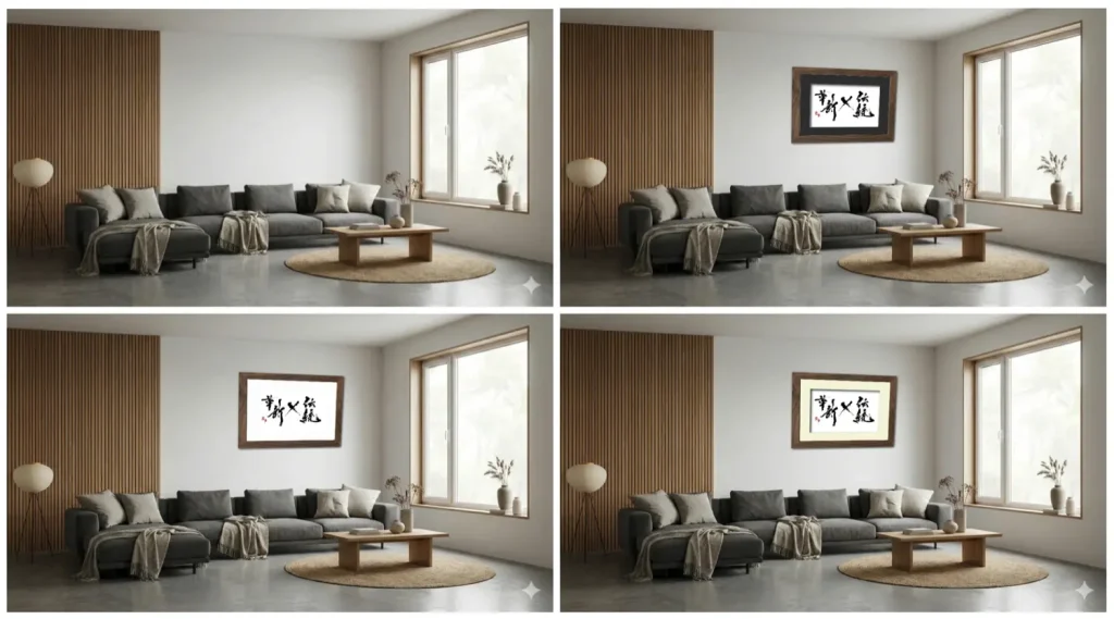
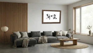
A Japandi living room transformed by the presence of “Sho”.
1. The Intersection of Wabi-Sabi and Hygge
Japandi is not just about placing bamboo furniture next to a Danish chair. It is the spiritual marriage of two philosophies:
- Hygge (Scandinavia): A feeling of cozy contentment and well-being.
- Wabi-Sabi (Japan): The acceptance of transience and imperfection.
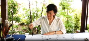
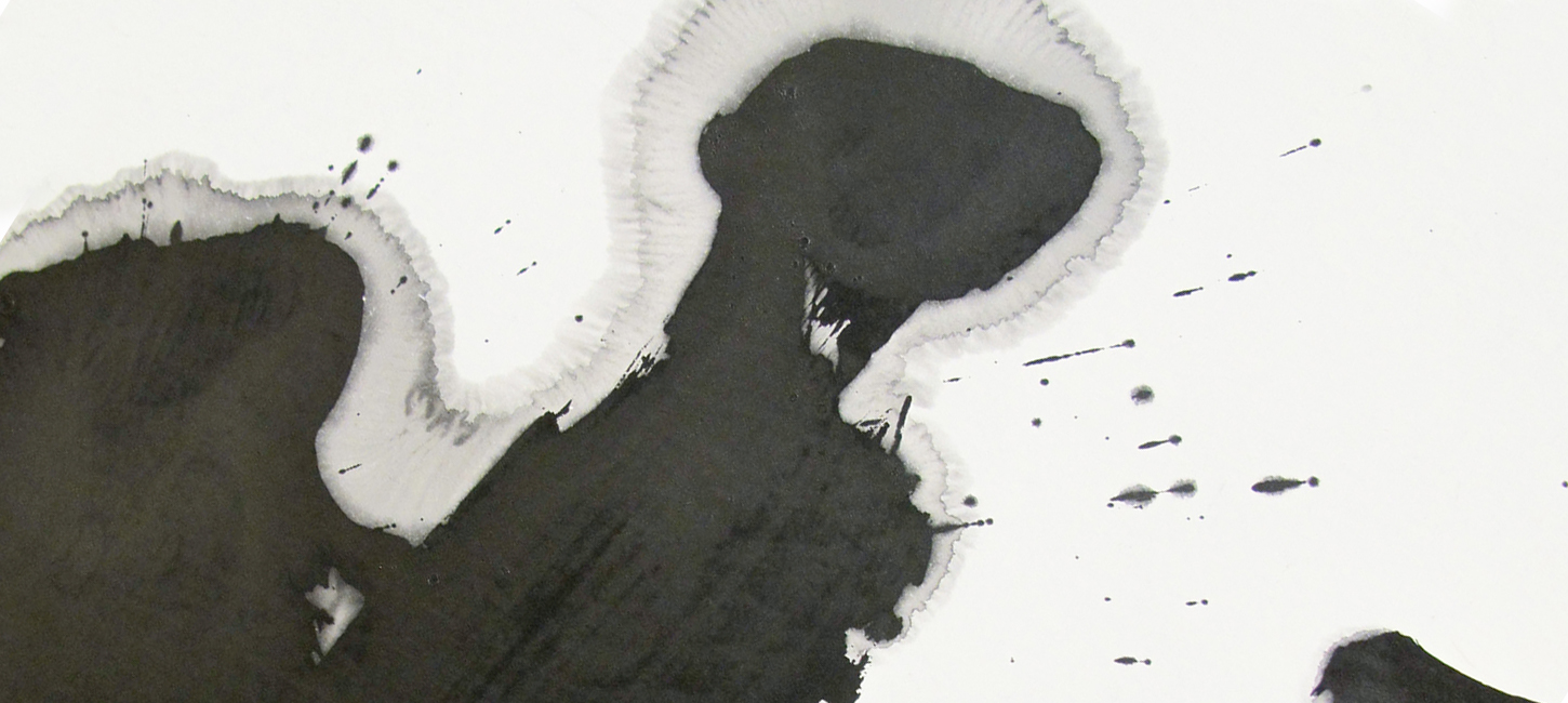
While Scandinavian design provides the “comfort” (Hygge), Japanese aesthetics must provide the “depth” (Wabi-Sabi). This is where “Sho” (Calligraphy Art) plays a crucial role. The ink marks are never perfect; they capture the momentary flow of energy, the “chi.” This organic irregularity breathes life into a room dominated by geometric furniture.
2. Designing with “Ma” (Negative Space)
In calligraphy, the white space where no ink touches is as important as the black strokes. We call this “Ma.”
In your home, “Ma” is the breathing room. Do not fill every wall with posters or shelves. By placing one significant piece of calligraphy on a large, empty wall, you create a focal point that brings silence and focus to the entire room.
Choosing the Right Art for Your Space
Not all calligraphy fits every room. Here is a guide to harmonizing “Sho” with your living spaces:
| Room | Atmosphere | Recommended Style |
|---|---|---|
| Living Room | Gathering & Energy | Abstract & Dynamic Works with bold strokes and ink splashes (Bokushou) to energize the space. |
| Bedroom | Rest & Silence | Minimal & Calm A single character or subtle lines. Soft ink tones (Grayish sumi) work best. |
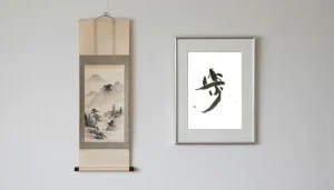
| Entryway | Welcome & Dignity | Vertical & Welcoming A hanging scroll format or a vertical frame that leads the eye upward. |
The texture of Washi paper adds warmth to the interior.
3. From “Decoration” to “Philosophy”
Unlike a printed poster, original calligraphy is alive. The ink soaks into the Washi paper, creating textures that change with the light of the day. It has a pulse.
Incorporating “Sho” into your Japandi home is not merely decoration. It is an act of bringing nature, history, and philosophy into your daily life. It reminds us to slow down, breathe, and appreciate the present moment.
Visualize It in Your Room
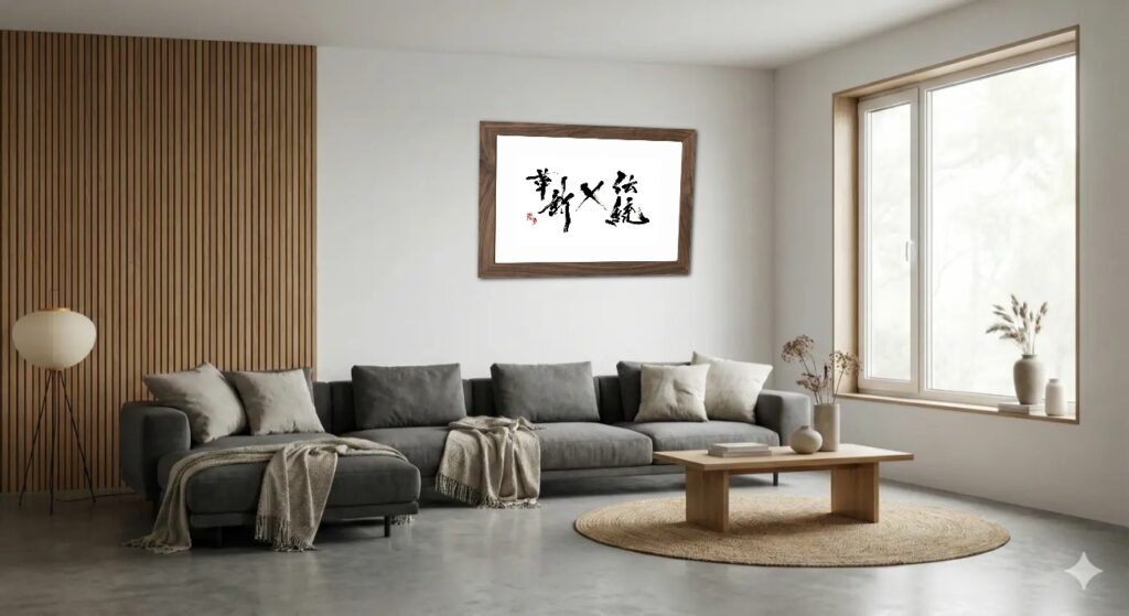
Curious how a piece of “Sho” would look on your wall? You don’t have to guess.
Use our Art Frame Visualizer to simulate our artwork in your actual room photos. Experience the harmony of Tradition and Innovation.
ジャパンディの本質:なぜ「書」が北欧インテリアの最後のピースなのか
近年、インテリアのトレンドとして定着しつつある「ジャパンディ(Japandi)」。
日本の素朴なミニマリズムと、北欧(スカンジナビア)の機能的な快適さを融合させたこのスタイルは、確かに美しいものです。清潔なライン、ニュートラルな色調、そして自然素材。
しかし、アーティストとしての視点から見ると、SNSで見かけるジャパンディ・スタイルの部屋には、時として「何か」が足りないと感じることがあります。
それは完璧にスタイリングされていますが、人が住む「家」というよりは、綺麗な「カタログ」のように見えてしまうのです。
足りないもの。それは「魂(Soul)」と「不完全さ(Imperfection)」ではないでしょうか。
「書」が一枚あるだけで、空間に物語が生まれます。
1. 「侘び寂び」と「ヒュッゲ」の交差点
ジャパンディとは、単に竹の家具と北欧の椅子を並べることではありません。それは二つの哲学の結婚です。
- ヒュッゲ(北欧):心地よい温かさ、幸福感、安らぎ。
- 侘び寂び(日本):不完全なもの、移ろいゆくものへの美意識。
北欧デザインが「快適さ(ヒュッゲ)」を提供するならば、日本のアートはそこに「深み(侘び寂び)」を与えなければなりません。ここで「書道アート」が重要な役割を果たします。
二度と同じ線は引けない一回性、墨の滲みや掠れ。その有機的な「ゆらぎ」こそが、幾何学的で整然とした家具の中に、生命の息吹を吹き込むのです。
2. 「間(Ma)」をデザインする
書において、墨が置かれていない白い空間(余白)は、書かれた線と同じくらい、時にはそれ以上に重要です。私たちはこれを「間(ま)」と呼びます。
インテリアにおいても同様です。全ての壁をポスターや棚で埋め尽くす必要はありません。広くて何もない壁に、意味のある「書」を一つだけ飾る。それだけで、部屋全体に心地よい静寂とフォーカルポイント(視線の集中点)が生まれます。
空間に合わせたアートの選び方
一口に書と言っても、全ての作品がどの部屋にも合うわけではありません。空間の目的に合わせた選び方のヒントをご紹介します。
| 部屋 | 雰囲気 | おすすめのスタイル |
|---|---|---|
| リビング | 集い・エネルギー | 抽象的・動的(墨象) 大胆な筆致や墨飛沫(しぶき)のある作品で、空間にエネルギーを与えます。 |
| 寝室 | 休息・静寂 | ミニマル・静的 一文字や、繊細な線のアート。黒すぎない、淡墨(グレー)の作品も安らぎを与えます。 |
| 玄関 | 迎え入れ・品格 | 縦のライン 掛け軸のスタイルや縦長の額装で、視線を上へと導き、家の品格を高めます。 |
和紙の温かなテクスチャは、天然素材を好むジャパンディと相性抜群です。
3. 「装飾」から「哲学」へ
プリントされたポスターとは異なり、肉筆の書は生きています。和紙に染み込んだ墨は、朝の光や夜の照明によって、その表情を変えます。
ジャパンディの空間に「書」を取り入れること。それは単なる装飾(デコレーション)ではありません。自然、歴史、そして哲学を日々の暮らしに招き入れる行為です。ふと壁を見た時に、深呼吸をして「今」を感じる。そんな豊かな時間がそこに生まれます。
あなたの部屋でシミュレーション
「自分の部屋に合うか不安」という方は、ぜひシミュレーターをお試しください。
スマホで撮影した部屋の写真をアップロードするだけで、壁に作品を飾ったイメージを確認できます。伝統と革新の調和を、あなたの目でお確かめください。