The living room is the heart of the home. It’s where you gather, relax, and entertain guests. Yet, so many luxury homes suffer from the same problem: the dreaded “Big Empty Wall” behind the sofa.
Filling this space with a gallery of small frames can feel cluttered. A generic print feels impersonal. If you want to elevate your space from a “room” to a “gallery,” the answer is simple: Go Big.
In this guide, we explore why large-scale, abstract Japanese calligraphy (“Sho”) is the ultimate statement piece for modern luxury living rooms.
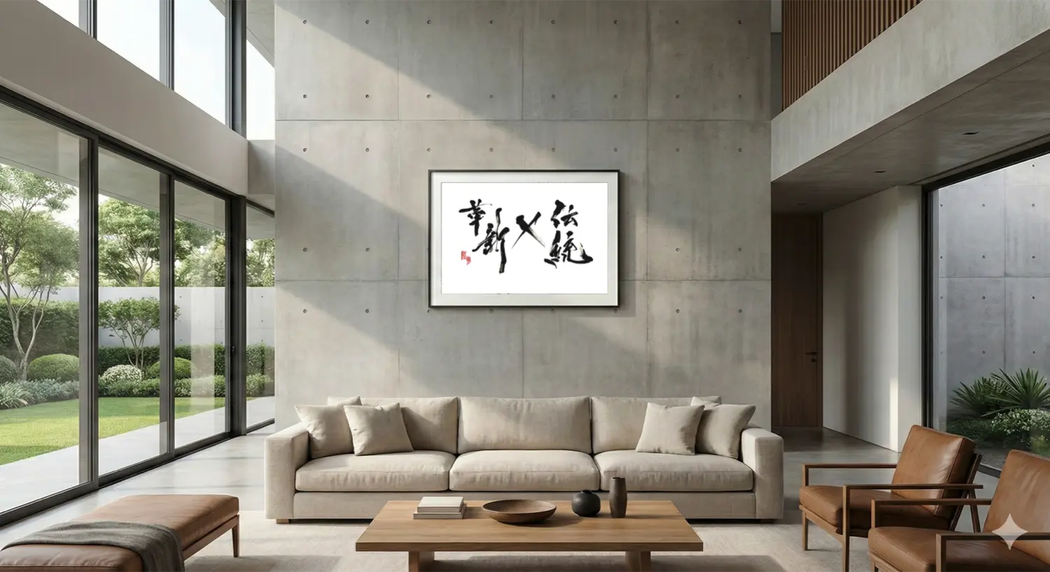
A single, large piece of art anchors the entire room.
1. More Than Just a Painting: Art with “Ki” (Energy)
Why choose black and white calligraphy over a colorful abstract painting for your main wall?
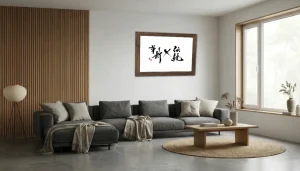
- The Ultimate Neutral: Monochrome art works with ANY color palette. Whether your sofa is beige linen, velvet green, or leather brown, the ink will complement it perfectly without clashing.
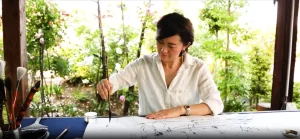
- Dynamic Movement: Unlike static paintings, “Sho” captures the moment of creation—the speed, rhythm, and splash of the brush. This injects dynamic “Ki” (energy) into the room, bringing the space to life.
- A Conversation Starter: A powerful, abstract calligraphy piece is intellectually intriguing. It invites guests to ask questions, sparking conversations about culture, philosophy, and aesthetics.
2. Sizing Guide: The Golden Rule for Sofas
The most common mistake homeowners make is choosing art that is too small. A tiny frame floating on a huge wall looks disconnected and timid.
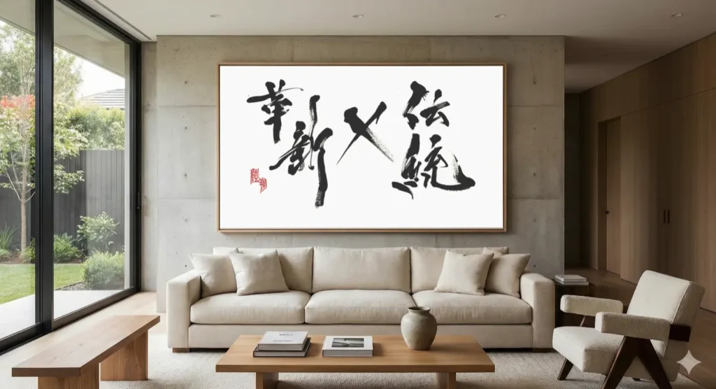
The Rule of Thumb: Your art should be roughly two-thirds (2/3) to three-quarters (3/4) the width of the furniture below it (usually your sofa).
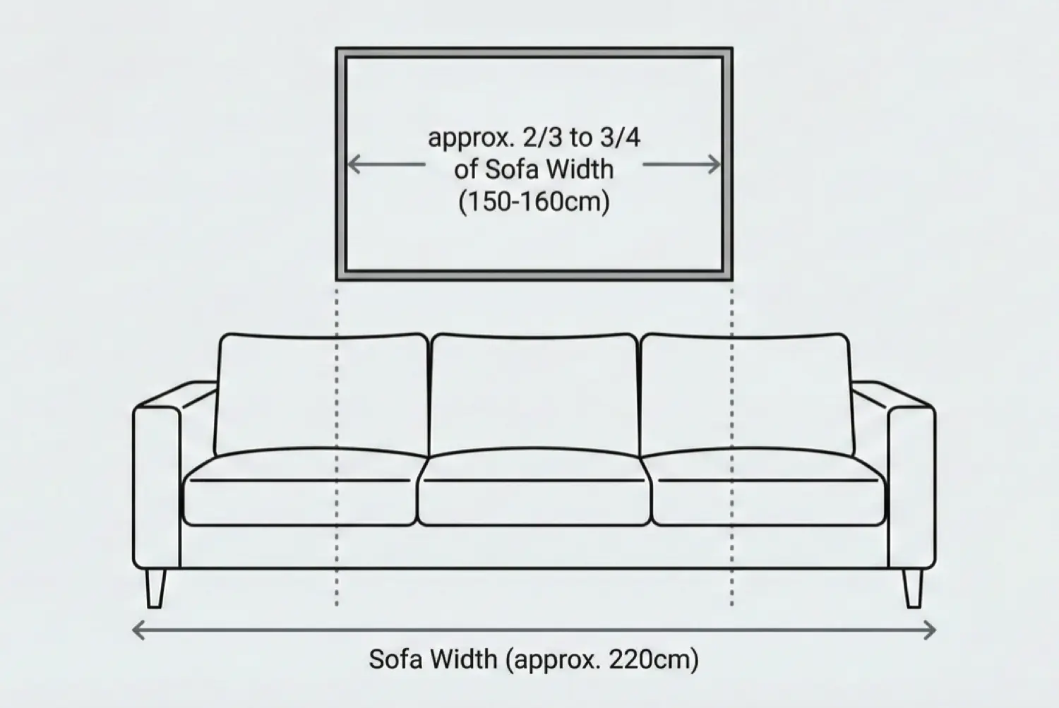
Don’t be afraid to go big. Size creates impact.
For example, if you have a standard 3-seater sofa (approx. 220cm wide), your art (or set of art) should be around 150cm–160cm wide. This scale creates balance and anchors the furniture grouping.
3. Styling Concepts: Contrast vs. Harmony
How do you want your living room to feel? Calligraphy can achieve different moods based on the style you choose.
Concept A: High Contrast (Modern & Energetic)
In a minimalist room with sharp lines and cool tones, introduce a wild, explosive abstract calligraphy piece (Bokushou). The organic chaos of the ink splashes creates a stunning contrast, making the room feel curated and avant-garde.
Concept B: Gentle Harmony (Japandi & Calm)
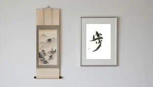
In a room with warm wood, beige textiles, and soft curves, choose a piece with rounded brushstrokes or a subtle “Enso” (Zen circle). Use soft gray ink instead of stark black. The art blends into the environment, enhancing the sense of peace.
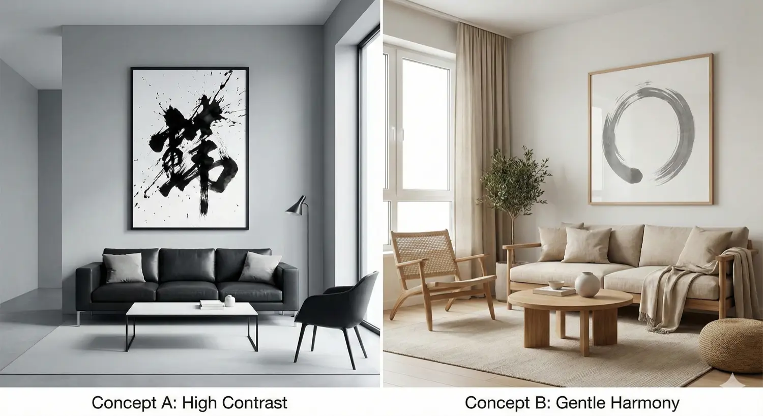
Left: Energetic Contrast. Right: Calm Harmony.
Visualize the Scale in Your Home
It’s hard to imagine how a 150cm piece of art will look just by measuring tape.
Take a photo of your living room wall and use our AR simulator to place large-scale works virtually. See the impact instantly.
リビングルームに「主張」を。大型アートとして「書」を選ぶ理由
リビングルームは家の心臓部です。家族が集い、リラックスし、ゲストをもてなす場所。しかし、多くのラグジュアリーな住宅が同じ問題を抱えています。それは、ソファの後ろにある「巨大な空白の壁」です。
このスペースを小さなフレームの集合体で埋めると、雑多な印象になりがちです。かといって、量産されたポスターでは個性がありません。もしあなたが、リビングを単なる「部屋」から「ギャラリー」へと格上げしたいなら、答えはシンプルです。「思い切り大きく(Go Big)」。
本ガイドでは、なぜ大型で抽象的な「書道アート(墨象)」が、モダンラグジュアリーなリビングにおける究極の「ステートメント・ピース(主役となるアート)」になり得るのかを解説します。
たった一枚の大きなアートが、部屋全体の印象を決定づけます。
1. 絵画以上の存在感:「気(エネルギー)」を纏うアート
メインの壁に、色彩豊かな抽象画ではなく、モノクロームの「書」を選ぶ理由とは何でしょうか?
- 究極のニュートラル:墨と和紙のアートは、どんなカラーパレットとも喧嘩しません。ソファがベージュのリネンであれ、グリーンのベルベットであれ、ブラウンのレザーであれ、完璧に調和し、空間を引き締めます。
- ダイナミックな動き:静止した絵画とは異なり、書は「創作の瞬間」を内包しています。筆の速度、リズム、飛び散る墨。それらが部屋に動的な「気(エネルギー)」を注入し、空間を生き生きとさせます。
- 会話のきっかけ(カンバセーション・スターター):力強く抽象的な書は、知的好奇心を刺激します。「これは何と書いてあるの?」「どうやって書いたの?」とゲストとの会話が弾み、文化や哲学について語り合う豊かな時間を生み出します。
2. サイズ選びの失敗しない法則(黄金比)
アート選びで最も多い失敗は、「サイズが小さすぎること」です。広い壁に小さなフレームがぽつんと浮いていると、自信なさげで、空間から切り離されたように見えてしまいます。
経験則(ルール・オブ・サム):
アートの幅は、その下に置く家具(通常はソファ)の幅の約3分の2(2/3)から4分の3(3/4)を目安にしましょう。
大きすぎることを恐れないでください。サイズこそがインパクトを生みます。
例えば、標準的な3人掛けソファ(幅約220cm)の場合、アート(または複数枚のセット)の全幅は150cm〜160cm程度が理想です。このスケール感がバランスを生み、家具とアートを一つのグループとしてまとめ上げます。
3. スタイリングのコンセプト:対比と調和
リビングルームをどのような雰囲気にしたいですか?選ぶ書のスタイルによって、異なるムードを演出できます。
コンセプトA:ハイ・コントラスト(モダン&エネルギッシュ)
シャープなラインとクールな色調のミニマルな部屋には、激しく爆発するような抽象書道(墨象)を合わせます。有機的な墨の混沌が、整然とした空間と鮮烈なコントラストを生み、アバンギャルドで洗練された印象になります。
コンセプトB:ジェントル・ハーモニー(ジャパンディ&穏やか)
温かみのある木材、ベージュのファブリック、柔らかな曲線のある部屋には、丸みを帯びた筆致の作品や、静かな「円相」を選びます。漆黒ではなく、柔らかな淡墨(グレー)を使うのも効果的です。アートが環境に溶け込み、平和な感覚を強調します。
左:エネルギッシュな対比。右:穏やかな調和。
自宅でのスケール感を視覚化する
メジャーで測るだけでは、150cmのアートが実際にどれくらいの迫力になるか想像するのは難しいものです。
リビングの壁をスマホで撮影し、ARシミュレーターを使って大型作品をバーチャルに配置してみてください。そのインパクトを瞬時に確認できます。