From the rustic warmth of a Farmhouse to the sharp lines of Urban Modern, the world of interior design is vast and diverse. Finding your own style is a journey of self-discovery.
However, regardless of the architectural style, every beautiful room shares one common element: “Soul.”
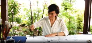
Japanese Calligraphy (“Sho”) is often misunderstood as only belonging in a traditional Tatami room. In reality, it is a versatile, abstract art form that transcends cultural boundaries. Whether acting as a harmonious element or a striking contrast, “Sho” elevates spaces across the design spectrum.
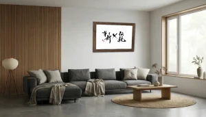
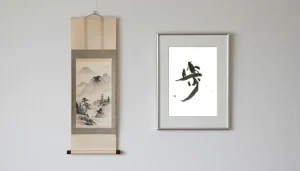
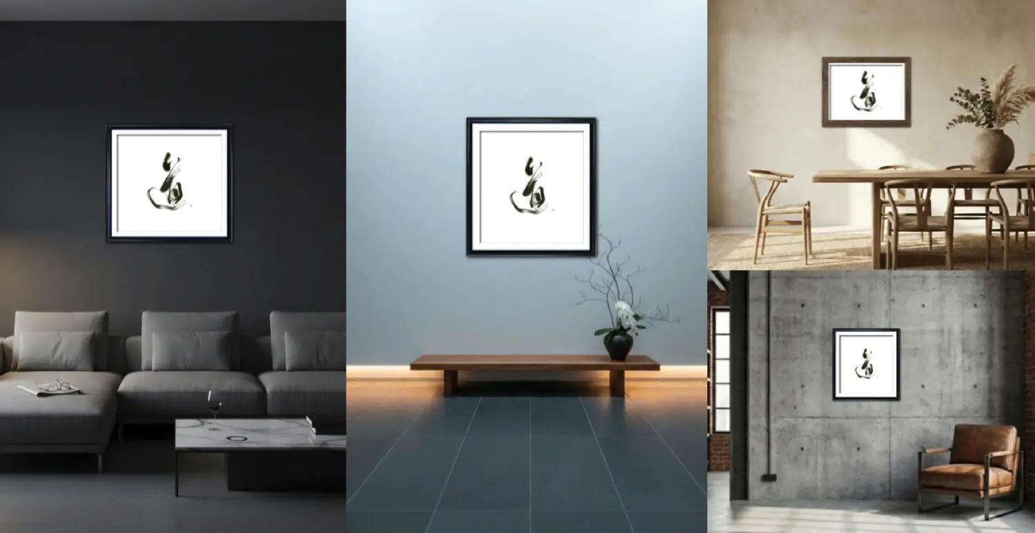 ” alt=”A collage showing Japanese calligraphy art placed in Japandi, Industrial, and Modern rooms.” />
One art form, infinite possibilities.
The Compatibility Matrix: Sho x Global Interiors
We have analyzed major global interior styles to see how they interact with the aesthetics of modern calligraphy. Use this chart to identify your home’s style and discover how to style it with ink.
| Style | Features & Keywords | Match with Calligraphy | Styling Tips |
|---|---|---|---|
| Japandi | Nordic functionality meets Japanese aesthetics. Neutral tones, wood, negative space. |
★★★★★ | Essential Element. Abstract works with ample negative space or “Enso” circles are best. Ensures spiritual depth. |
| Zen / Japanese Modern | Silence, meditation, low center of gravity, natural materials. Minimalist focus on spiritual richness. |
★★★★★ | The Centerpiece. Ideal for a “Tokonoma” effect. Use hanging scrolls or frames that highlight the texture of Washi paper. |
| Minimalism | “Less is More”. Reducing objects to the absolute minimum; pursuing quality. |
★★★★★ | Focal Point. Placing a single, high-impact black ink piece in an empty space grounds and tightens the room. |
| Scandinavian | Functional beauty, brightness, Hygge. Light wood furniture, textiles. |
★★★★☆ | The Anchor. Black ink adds a modern edge to pale tones, preventing the look from being too soft. Pale ink (Usuzumi) also works well. |
| Industrial | Converted factory style. Concrete, iron, brick, exposed pipes. |
★★★★☆ | Mixed Materials. Organic brushstrokes stand out against inorganic concrete. Black steel frames are recommended. |
| Urban Modern | City chic, sophisticated, hotel-like. Glass, leather, dark tones. |
★★★★☆ | Luxury Accent. Avant-garde “Bokushou” (Abstract) fits perfectly. Large-scale art creates a high-end hotel atmosphere. |
| Contemporary | The “Now”. Current trends, curves, bold colors. |
★★★★☆ | As Modern Art. Display it as an abstract painting rather than text. |
| Mid-Century Modern | 1950s style. Functional organic curves. Walnut, vivid colors. |
★★★☆☆ | Period Harmony. Harmonizes with the Abstract Expressionism of the era. Wooden frames are recommended. |
| Art Deco | Glamorous. Geometric patterns, gold, velvet, high contrast. |
★★★☆☆ | Fusion with Gold. Gold frames or works using Gold Ink (Kindei) can match the opulence. |
| Bohemian / Boho | Free-spirited, ethnic, plants, macrame, layering. |
★★★☆☆ | Free Spirit. Unconventional characters or fluid lines fit the relaxed vibe. |
| Coastal Chic | Seaside home. Blue, white, light, linen, driftwood. |
★★☆☆☆ | Water Imagery. Avoid heavy black; choose Pale Ink (Usuzumi) or works with flow evoking water and wind. |
| Traditional / Classic | 18th-19th C. European. Antiques, symmetry, heavy ornamentation. |
★★☆☆☆ | Oriental Mystery. Use calligraphy as a sophisticated “Chinoiserie” accent amidst Western antiques. |
| Farmhouse / Country | Rustic rural. Reclaimed wood, white, warmth, rustic. |
★★☆☆☆ | Texture Match. Use reclaimed wood frames and choose simple, rustic characters. |
Decoding the Groups
Group A: The Perfect Marriage (Japandi, Zen, Minimalism)
These styles share the same DNA as Shodo: “Love for Nature” and “Beauty of Emptiness.”
In these rooms, calligraphy is not just an accessory; it is the final piece of the puzzle that completes the philosophy of the space. Without it, the room might feel too empty or sterile.
Group B: The Modern Edge (Industrial, Urban, Contemporary)
Here, the relationship is about “Contrast.”
The organic, unpredictable splashes of ink provide a necessary counterpoint to the rigid, man-made materials like concrete, glass, and steel. It adds a human touch and intellectual depth to cool, modern spaces.
Group C: The Eclectic Mix (Classic, Boho, Coastal)
This group requires a more thoughtful approach, but the reward is high. Mixing a traditional Japanese art form into a European Classic or Bohemian room creates a sophisticated, “Traveled” look. It shows that the owner has a global perspective and an appreciation for diverse cultures.
What is Your Style?
In upcoming articles, we will dive deeper into each of these styles, showcasing specific examples of how to integrate calligraphy perfectly.
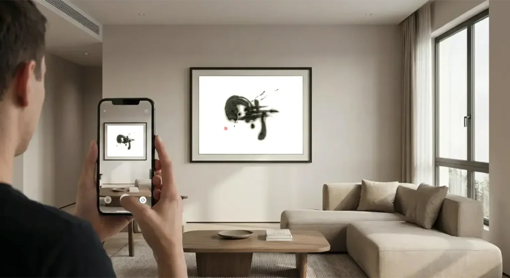
For now, why not test your own home’s style? Upload a photo to our simulator and see which “Group” your room belongs to.
インテリアスタイル図鑑:世界のデザインと「書」の調和について
素朴で温かみのあるファームハウスから、都会的で洗練されたアーバンモダンまで。インテリアデザインの世界は広大で多様です。自分のスタイルを見つけることは、自分自身を知る旅でもあります。
しかし、どのような建築様式であれ、美しい部屋には共通する要素があります。それは「魂(ソウル)」です。
日本の書(Sho)は、畳の部屋にしか合わないと誤解されがちです。しかし実際には、書は国境や文化を超越した、極めて自由で抽象的なアートフォームです。調和する要素として、あるいは鮮烈なアクセントとして、書はあらゆるスタイルの空間を格上げする力を持っています。
一つのアート、無限の可能性。
相性診断チャート:世界のインテリア × 書道アート
世界の主要なインテリアスタイルを分析し、現代的な書道アートとの相性をマトリクスにまとめました。あなたの家のスタイルを見つけ、どのように「墨」を取り入れるべきかのヒントにしてください。
| スタイル | 特徴・キーワード | 書との相性 | スタイリングのポイント |
|---|---|---|---|
| Japandi (ジャパンディ) |
北欧の機能性 × 日本の美意識。 ニュートラルカラー、木、余白。 |
★★★★★ | 必須要素。 余白の多い抽象作品や、円相などがベスト。空間の「精神性」を担保する。 |
| Zen / Japanese Modern (禅 / 和モダン) |
静寂、瞑想、低い重心、自然素材。 ミニマルで精神的な豊かさを重視。 |
★★★★★ | 主役(床の間)。 掛け軸スタイルや、和紙の質感を前面に出した額装で。 |
| Minimalism (ミニマリズム) |
「Less is More」。 モノを極限まで減らし、質を追求。 |
★★★★★ | フォーカルポイント。 何もない空間に、黒の強いインパクトを一点だけ置くことで、空間が引き締まる。 |
| Scandinavian (北欧スタイル) |
機能美、明るさ、ヒュッゲ。 白木の家具、ファブリック。 |
★★★★☆ | 引き締め役。 淡い色調の中に「墨の黒」が入ると、空間がボヤけずモダンになる。淡墨も◎。 |
| Industrial (インダストリアル) |
工場跡地風。コンクリート、鉄、 レンガ、剥き出しの配管。 |
★★★★☆ | 異素材ミックス。 無機質なコンクリート壁に、有機的な「筆致」が映える。黒いスチールフレーム推奨。 |
| Urban Modern (アーバンモダン) |
都会的、洗練、ホテルライク。 ガラス、レザー、ダークトーン。 |
★★★★☆ | ラグジュアリー。 前衛的な「墨象」が合う。大きめのアートで、高級ホテルのような演出を。 |
| Contemporary (コンテンポラリー) |
「今」のスタイル。流行を取り入れ、 曲線や大胆な色使いも含む。 |
★★★★☆ | モダンアートとして。 「文字」としてではなく「抽象画」として配置する。 |
| Mid-Century Modern (ミッドセンチュリー) |
1950年代風。機能的で有機的な曲線。 ウォールナット、ビビッドな色。 |
★★★☆☆ | 時代の調和。 当時の抽象表現主義(アクションペインティング)と書の相性が良い。木のフレームで。 |
| Art Deco (アールデコ) |
豪華絢爛。幾何学模様、金、 ベルベット、強いコントラスト。 |
★★★☆☆ | ゴールドとの融合。 金色の額縁に入れたり、金泥を使った作品なら、デコの豪華さに負けない。 |
| Bohemian / Boho (ボヘミアン) |
自由奔放、民族的、植物、 マクラメ、レイヤード。 |
★★★☆☆ | 自由な精神。 型にハマらない「崩した文字」や、流れるような線の作品が合う。 |
| Coastal Chic (コースタル) |
海辺の家。青、白、光、 リネン、ドリフトウッド。 |
★★☆☆☆ | 水のイメージ。 重たい黒は避け、「水」や「風」を感じさせる淡墨や、余白の多い作品を選ぶ。 |
| Traditional / Classic (トラディショナル) |
18-19世紀欧州風。アンティーク、 シンメトリー、重厚な装飾。 |
★★☆☆☆ | 東洋の神秘。 あえて西洋骨董の中に「シノワズリ(中国趣味)」的なアクセントとして飾る高度なテクニック。 |
| Farmhouse / Country (ファームハウス) |
素朴な田舎家。古材、白、 温かみ、ラスティック。 |
★★☆☆☆ | 素材感の統一。 古材のフレームを使い、素朴な言葉を選ぶと馴染む。 |
グループ別ガイド
Group A: 完璧な調和(ジャパンディ、禅、ミニマリズム)
これらのスタイルは、書道と同じDNA、すなわち「自然への愛」と「余白の美」を共有しています。
このグループにおいて、書は単なるアクセサリーではありません。空間の哲学を完成させるための、不可欠なピースです。書がなければ、部屋はただ「空っぽ」に見えてしまうかもしれません。
Group B: モダンな対比(インダストリアル、アーバン、コンテンポラリー)
ここでのキーワードは「コントラスト」です。
コンクリート、ガラス、スチールといった硬質で人工的な素材に対し、有機的で予測不可能な墨の飛沫が、強烈な対比を生みます。それはクールな空間に、人間味と知的な深みを与えるスパイスとなります。
Group C: 折衷の妙(クラシック、ボヘミアン、コースタル)
このグループは少し工夫が必要ですが、成功すれば非常に高度なスタイルになります。西洋のクラシックな部屋や自由なボヘミアンスタイルの中に、伝統的な日本の芸術を混ぜることで、洗練された「旅慣れた(Traveled)雰囲気」を作り出せます。それは、家主がグローバルな視点と多様な文化へのリスペクトを持っていることの証明です。
あなたのスタイルは?
今後の記事では、これらのスタイル一つひとつを深掘りし、具体的にどのような作品を合わせるべきか、実例を交えてご紹介していきます。
まずは、シミュレーターを使ってあなたの家の写真をアップロードし、どのグループに属するか、そして書がどう馴染むかを試してみてください。