When styling a modern home, “Abstract Art” is often the go-to choice. It’s safe, versatile, and fits contemporary furniture. But scrolling through online art marketplaces, you might start to feel a sense of déjà vu. Many abstract prints feel flat, repetitive, or purely decorative.
If you are looking for art that brings not just style but “Spirit” and “Depth” to your walls, it is time to look beyond Western abstract painting and discover the world of Modern Japanese Calligraphy (“Bokushou”).
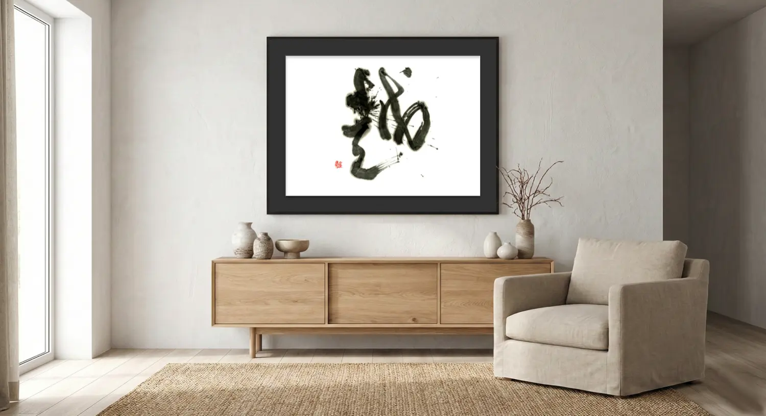
More than just shapes. Art with a pulse.
1. The Art of the “One-Shot” (Ikkai-sei)
The fundamental difference between Western oil/acrylic painting and Japanese Calligraphy is time. A painting can be corrected, layered, and painted over. Perfection is achieved through addition.
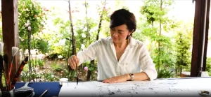
Calligraphy is the art of subtraction and the instant. Once the brush touches the paper, there is no going back. No corrections. No hesitation. This creates a powerful tension and energy (Ki) in the lines that cannot be replicated. When you hang calligraphy, you are displaying a captured moment of pure focus and raw emotion.
2. Texture: Ink vs. Paint
In Japandi and luxury interiors, texture is king.
- Paint: Sits on top of the canvas.
- Ink (Sumi): Fuses with the paper.
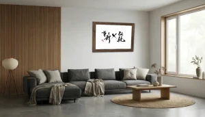
The ink soaks into the fibers of the handmade Washi paper, creating a depth and warmth that feels organic. The “Nijimi” (blurring) and “Kasure” (brush streaks) create a landscape within the stroke itself. This organic texture softens the hard lines of modern architecture in a way that flat prints never can.
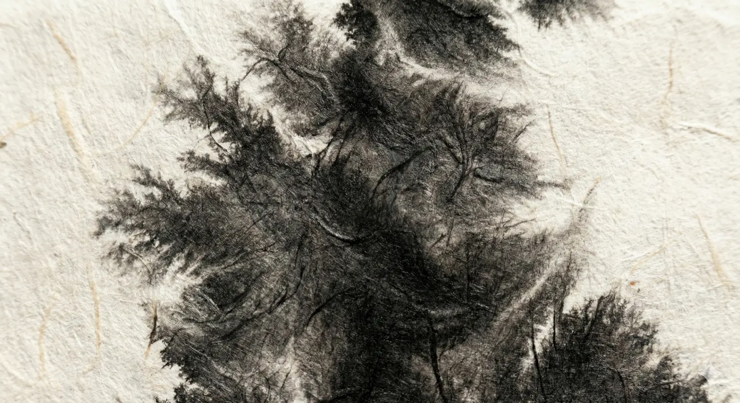
The organic fusion of ink and paper adds warmth to a room.
3. Meaning in the Abstract
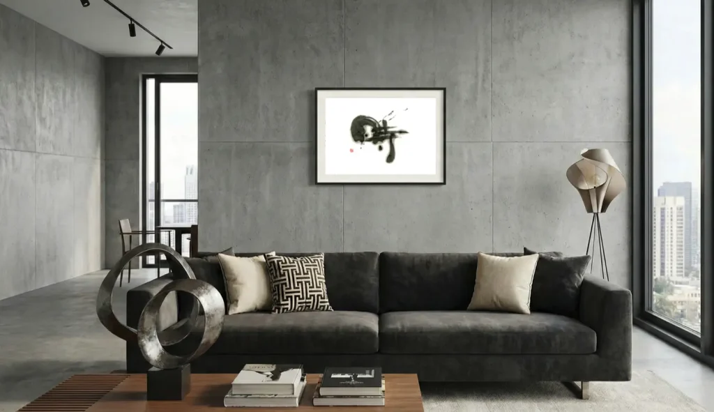
Western abstract art is often purely visual—about composition and color. Abstract Calligraphy, while visually striking, is deeply rooted in concept.
Even if the character is illegible (exploded into abstract forms), the artist started with a concept like “Wind,” “Sound,” or “Nothingness.” This underlying “core” gives the artwork a spiritual weight. It is not just a random splash; it is the visual manifestation of a philosophy.
4. A Unique Investment
In a world of mass-produced giclée prints, owning an original hand-brushed work is a true luxury. No two strokes are ever identical. It tells your guests that you value tradition, craftsmanship, and the beauty of the imperfection.
Experience the Difference
Replace the generic with the genuine.
Use our AR simulator to see how the texture and energy of real ink art transforms your space compared to standard prints.
「抽象画」のその先へ:なぜモダンな家には書の「魂」が必要なのか
モダンな家をスタイリングする際、「抽象画(Abstract Art)」は最も選ばれやすい選択肢です。無難で、どんな現代家具にも合いやすいからです。しかし、オンラインのアートショップを眺めていて、既視感(デジャヴ)を覚えたことはありませんか? 多くの抽象画プリントは、平面的で、反復的で、単なる「模様」のように感じられることがあります。
もしあなたが、単なるスタイルだけでなく、壁に「精神性」と「深み」をもたらすアートを探しているなら、西洋的な抽象画の枠を超えて、現代の書(墨象)の世界に触れてみてください。
単なる形ではない。脈打つようなアート。
1. 「一回性」という芸術
油絵やアクリル画と、書道の根本的な違いは「時間」にあります。絵画は塗り重ね、修正し、加筆することができます。「足し算」の芸術です。
対して書は、「引き算」と「瞬間」の芸術です。一度筆が紙に触れれば、後戻りはできません。修正も、迷いも許されない。この緊張感が、線に二度と再現できない「気」を宿します。
書を飾るということは、画家が何ヶ月もかけて描いた絵を飾るのとは異なり、アーティストの極限の集中と感情が爆発した「瞬間」を共有することなのです。
2. テクスチャ:乗せるか、染み込むか
ジャパンディやラグジュアリーなインテリアにおいて、質感(テクスチャ)は王様です。
- 塗料:キャンバスの上に乗ります。
- 墨:紙と一体化します。
墨は和紙の繊維の奥深くまで染み込み、有機的で温かみのある奥行きを生み出します。「滲み(にじみ)」や「掠れ(かすれ)」は、それ自体が一つの風景のようです。この有機的なテクスチャこそが、フラットなプリント作品には決して出せない、モダンな建築空間への「柔らかな調和」をもたらします。
インクと紙の有機的な融合が、空間に温かみを与えます。
3. 抽象の中にある「意味」
西洋の抽象画の多くは、純粋に視覚的な構成や色彩の実験です。一方、抽象書道(墨象)は、どれほど形が崩れていても、そこには「概念」という根っこがあります。
たとえ文字として読めないほど抽象化されていたとしても、アーティストは「風」「響」「無」といったコンセプトから出発しています。その根底にある「核」が、作品に精神的な重みを与えます。それは単なるランダムな飛沫ではなく、哲学の視覚化なのです。
4. 唯一無二の投資
大量生産されたジークレー版画(高品質プリント)が溢れる世界において、手書きの「原画」を所有することは真の贅沢です。
二つとして同じ線は存在しません。本物の書を飾ることは、あなたが伝統や職人技、そして不完全さの美を重んじる人物であることを、ゲストに静かに語りかけます。
違いを体験する
「ありふれたもの」から「本物」へ。
ARシミュレーターを使って、本物の墨のアートが放つエネルギーと質感が、標準的なプリントアートとどう違うのか、あなたの壁で比較してみてください。