The Japandi Guide: How to Integrate Authentic Japanese Calligraphy into Your Interior Design
Introduction: Why Japandi Needs Calligraphy
The Japandi movement, a celebrated hybrid of Japanese minimalism and Scandinavian functionality, champions simple lines, neutral palettes, and natural materials. While the core philosophy is sound, Japandi interiors often risk becoming sterile or cold. The key to injecting warmth, depth, and soul into a Japandi space lies in utilizing authentic Japanese art that honors the concept of Wabi-Sabi—and nothing does this better than Contemporary Calligraphy Art.
This guide provides practical and philosophical advice on how to successfully integrate dynamic, expressive calligraphy into your Japandi-style home or commercial space.
1. Understanding the Core Conflict: Simplicity vs. Sterility
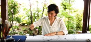
The danger of pure minimalism is that it can eliminate personality. Japandi solves this by focusing on natural textures (wood, linen) and handcrafted items. Calligraphy takes this a step further: it is the ultimate expression of handmade authenticity.
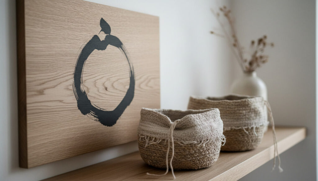
- The Zen of Imperfection: Japandi embraces imperfection. A single, bold stroke of calligraphy contrasts perfectly with smooth walls and clean-lined furniture. It serves as a visual reminder of human presence and the beauty found in the asymmetrical and spontaneous.
- Defining the ‘Ma’ (Void): In Japandi design, space is as important as the object. By strategically placing a calligraphic work, the artwork utilizes the surrounding white wall (the Ma) as part of its of its composition, enhancing the sense of tranquility and open space.
2. Practical Integration Tips for Japandi Interiors
Successfully integrating calligraphy requires careful consideration of scale, color, and framing to ensure harmony with the clean Japandi aesthetic.
A. Scale and Placement
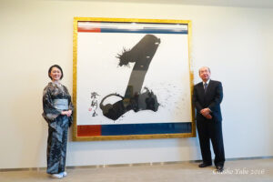
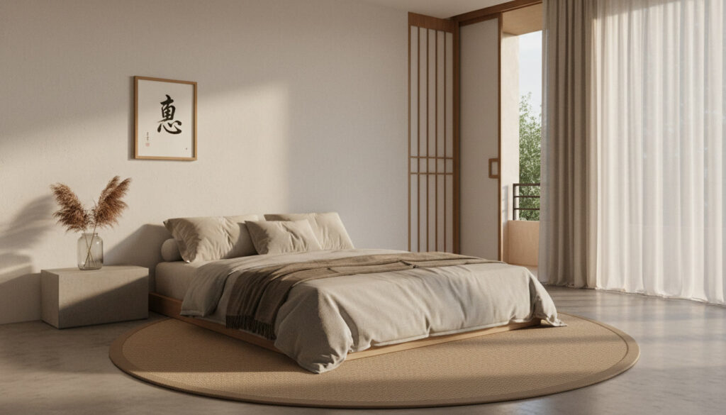
- Living Room/Lobby: Opt for large-scale, statement pieces (e.g., F100 size) placed over a low sideboard or sofa. The large scale honors the minimalist principle of fewer, better things.
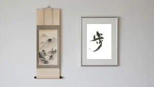
- Bedroom/Quiet Space: Choose smaller, framed works focusing on subtle textures and soft ink tones to enhance a sense of peace and contemplation.
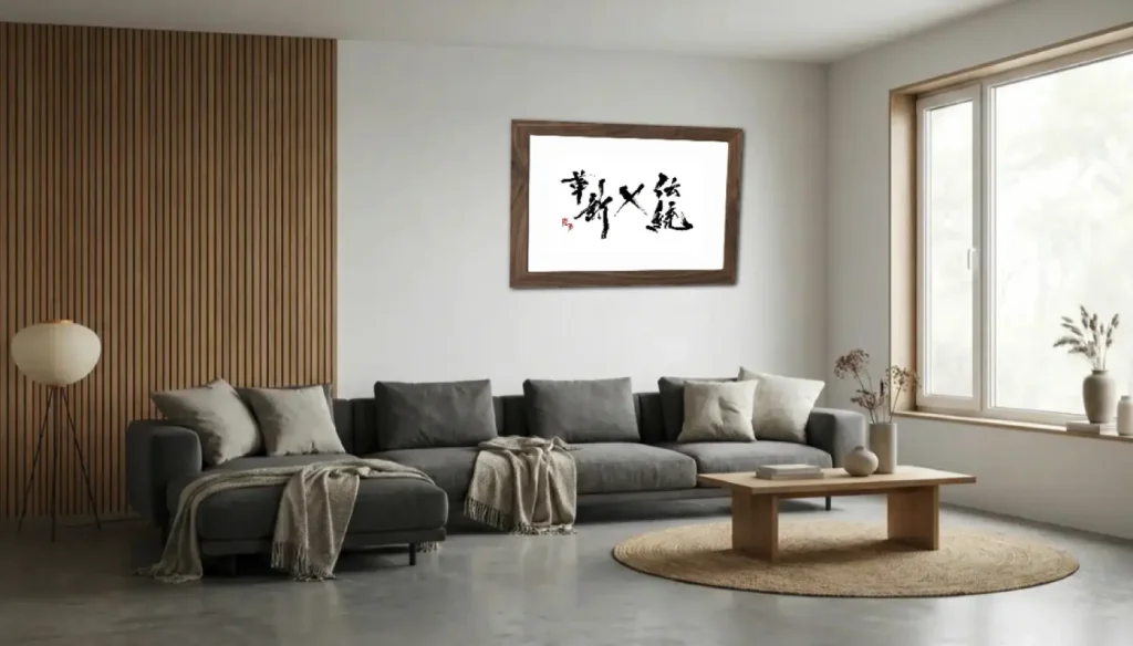
- The Rule of Contrast: The artwork should be the most dynamic element in the room. Pair bold, black ink with light oak, whitewashed walls, and woven textures.
B. Framing and Substrates
The framing must avoid ornate traditional styles.
- Recommended Framing: Utilize simple, minimalist frames in matte black, pale natural wood (oak/ash), or opt for a shadow box to emphasize the texture of the paper or canvas.
- Modern Substrates: For longevity and a contemporary look, consider works on canvas or mounted behind non-reflective acrylic, which offers a sleek, durable finish suitable for Japandi’s functional approach.
3. The Philosophical Connection: More Than Just Words
The power of calligraphy in a Japandi context extends beyond aesthetics; it deepens the philosophical roots of the design.
- Integrating Core Concepts: Choose a Kanji that reflects the room’s purpose or the inhabitant’s philosophy. For instance, Wa (和, Harmony) for the living room or Shoshin (初心, Beginner’s Mind) for an executive office.
- Storytelling: The artwork becomes a conversation starter, connecting the physical space to ancient wisdom, elevating the perceived value of the entire room.
Japandiガイド:本物の書道アートをインテリアデザインに取り入れる方法
はじめに:なぜJapandiに書アートが必要なのか
Japandiムーブメントは、日本のミニマリズムとスカンジナビアの機能性を融合させた人気のハイブリッドスタイルで、シンプルなライン、ニュートラルな配色、自然素材を特徴としています。しかし、その哲学は素晴らしい一方で、Japandiインテリアはともすると無機質で冷たい空間になりがちです。この空間に温かさ、深み、魂を注入する鍵は、侘び寂びの概念を尊重する本物の日本アートを利用することにあり、何もかもが現代書道アートほどそれをうまく行うものはありません。
このガイドでは、ダイナミックで表現豊かな書をJapandiスタイルの住宅や商業空間に成功裏に組み込むための、実用的かつ哲学的なアドバイスを提供します。
1. 核心的な対立の理解:簡素 vs. 無機質
純粋なミニマリズムの危険性は、個性を排除してしまう点にあります。Japandiは、自然素材(木材、リネン)や手作りのアイテムに焦点を当てることでこれを解決します。書アートはさらに一歩進んで、手作業による本物らしさの究極の表現となります。
- 不完全さの禅: Japandiは不完全さを受け入れます。単一の、大胆な書道のストロークは、滑らかな壁やクリーンなラインの家具と完璧なコントラストをなし、人間の存在と、非対称かつ自発的なものの中に見出される美を視覚的に想起させます。
- 「間(Ma)」を定義する: Japandiデザインにおいて、空間はモノと同じくらい重要です。書作品を戦略的に配置することで、アートは周囲の白い壁(間)を構図の一部として活用し、静寂と開放感を高めます。
2. Japandiインテリアのための実用的な統合のヒント
書アートを成功裏に統合するには、クリーンなJapandiの美学との調和を確保するために、スケール、色、フレーミングを慎重に考慮する必要があります。
A. スケールと配置
- リビング/ロビー: 低いサイドボードやソファの上に配置する、大判のステートメント作品(例:F100サイズ)を選択します。大きなスケールは、「数は少なく、質は高く」というミニマリズムの原則を尊重します。
- 寝室/静かな空間: 落ち着きと内省の感覚を高めるために、微妙なテクスチャと柔らかな墨の色に焦点を当てた、小ぶりの額装作品を選びます。
- コントラストのルール: アートワークは部屋の中で最もダイナミックな要素であるべきです。大胆な黒い墨を、明るいオーク材、白塗りの壁、織物といったテクスチャと組み合わせます。
B. 額装と基材
額装は、装飾的な伝統的なスタイルを避ける必要があります。
- 推奨される額装: マットブラック、淡い天然木(オーク/アッシュ)のシンプルな額、または紙やキャンバスのテクスチャを強調するシャドーボックスを活用します。
- モダンな基材: 長寿命と現代的な外観のために、キャンバス上の作品や、非反射性アクリルの裏打ち作品を検討してください。これは、Japandiの機能的なアプローチに適した洗練された耐久性のある仕上がりを提供します。
3. 哲学的な繋がり:言葉以上のもの
Japandiの文脈における書アートの力は、美学を超えて、デザインの哲学的根幹を深めます。
- 中核となる概念の統合: 部屋の目的や住人の哲学を反映する漢字を選択します。例えば、リビングには和(調和)、エグゼクティブオフィスには初心(ビギナーズマインド)など。
- ストーリーテリング: アートワークは会話のきっかけとなり、物理的な空間を古代の知恵に結びつけ、部屋全体の価値を高めます。