Exposed brick walls, concrete floors, raw steel beams. The Industrial style celebrates the beauty of structure and age. It is masculine, edgy, and undeniably cool.
However, industrial spaces can sometimes feel cold or too harsh. To make a converted loft feel like a home, you need to introduce organic elements that soften the hard edges without sacrificing the “cool factor.”
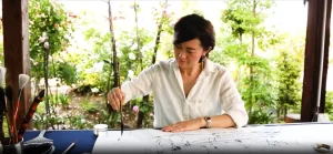
This is where Japanese Calligraphy (“Sho”) shines. The raw energy of ink splashed onto handmade paper creates a stunning contrast against industrial materials, bridging the gap between “Raw” and “Refined.”
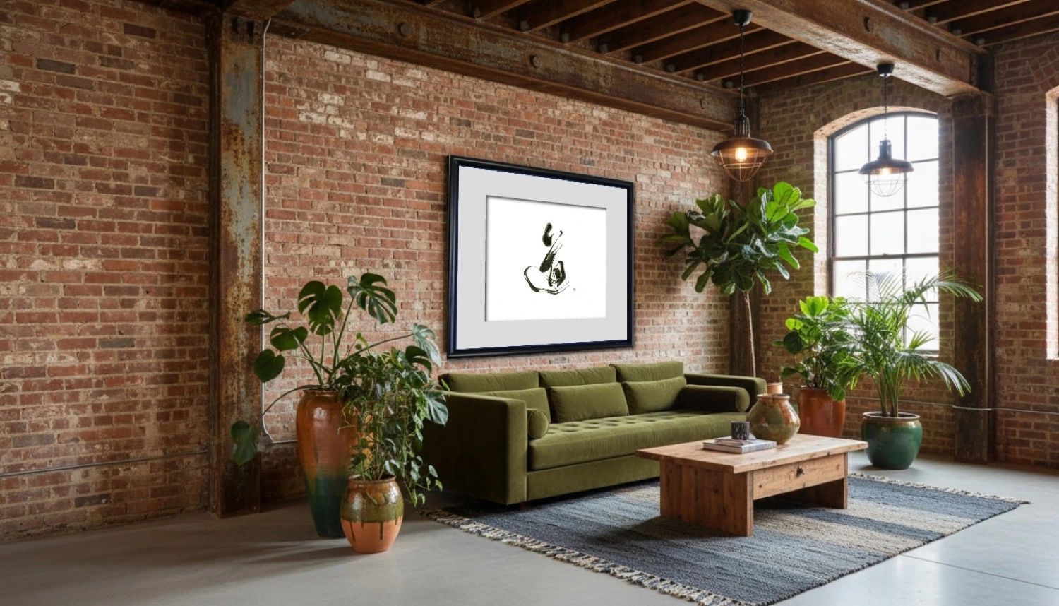
Organic ink meets inorganic concrete. The ultimate contrast.
1. Concrete and Ink: A Love Story in Grey
Industrial design is built on a palette of greys. From the light cool grey of concrete to the dark charcoal of iron. Japanese calligraphy fits into this palette naturally, but adds a new layer of depth.
“Sumi” ink is not flat black. It contains infinite shades of grey. When placed on a concrete wall, the matte texture of the Washi paper contrasts beautifully with the cold, hard surface of the wall. It adds warmth and “human touch” to an otherwise mechanical space.
2. The Beauty of “Raw” Materials
Industrial style loves materials in their raw, unfinished state. Japanese aesthetics shares this appreciation.
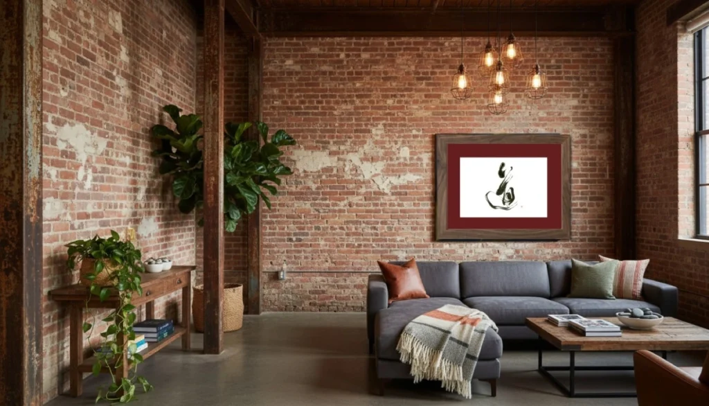
- Unfinished Edges: We recommend “float mounting” your calligraphy to show the raw, torn edges (deckle edge) of the handmade paper. This mirrors the rough texture of exposed brick.
- Visible Structure: Just as industrial design exposes pipes and beams, calligraphy exposes the structure of the brushstroke. The “Kasure” (scratchy streaks) show the friction between brush and paper, celebrating the process of creation.
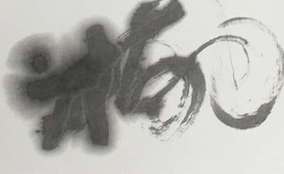
Rough paper edges complement the texture of aged brick.
3. Styling Tips: Framing for Industry
To make traditional calligraphy work in an industrial setting, the framing is key. Forget ornate gold frames.
- Black Steel / Iron: A thin, matte black metal frame echoes the black iron of industrial window frames and furniture legs.
- Reclaimed Wood: For a warmer look, use old, weathered wood frames. This ties in with vintage factory aesthetic.
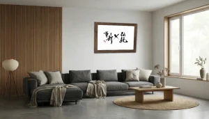
- Large Scale: Industrial spaces often have high ceilings. A tiny picture will get lost. Go for large-scale, powerful characters that can command the vertical space.
4. Recommended Art Style
For this masculine style, choose art that is Bold and Dynamic.
- “Bokushou” (Avant-Garde): Abstract ink splashes that look like action painting.
- Powerful Kanji: Words like “Iron” (鉄), “Wind” (風), or “Build” (建) written with thick, heavy strokes.
Soften the Edge
Does your loft need a touch of organic warmth?
Upload a photo of your concrete or brick wall to our simulator and see how the raw elegance of calligraphy transforms the space.
「未加工」と「洗練」:インダストリアル・インテリアに書が完璧にマッチする理由
剥き出しのレンガ壁、コンクリートの床、無骨な鉄骨。インダストリアル・スタイルは、構造と経年変化の美しさを称えるスタイルです。それは男性的で、エッジが効いていて、紛れもなくクールです。
しかし、インダストリアルな空間は、時として冷たく、荒々しすぎると感じられることがあります。リノベーションしたロフトを「住まい」として心地よくするためには、そのクールさを損なうことなく、硬いエッジを和らげる「有機的な要素」を取り入れる必要があります。
ここで輝きを放つのが、日本の書道アート(Sho)です。手漉き和紙に叩きつけられた墨の生のエネルギーは、工業的な素材と鮮烈なコントラストを生み出し、「未加工(Raw)」と「洗練(Refined)」の間の架け橋となります。
有機的な墨と、無機質なコンクリート。究極のコントラスト。
1. コンクリートと墨:グレーの調和
インダストリアル・デザインは、グレーのパレットの上に成り立っています。コンクリートの明るいクールグレーから、鉄の暗いチャコールグレーまで。日本の書は、このパレットに自然に馴染みますが、そこに新たな深みを加えます。
「墨」は単なる黒ではありません。そこには無限のグレーが含まれています。コンクリートの壁に書を飾ると、和紙のマットな質感が、壁の冷たく硬い表面と美しく対比されます。それは、機械的な空間に「人の温もり」を加えるのです。
2. 「素材感」への共鳴
インダストリアル・スタイルは、素材の「生のまま(Raw)」の状態を愛します。日本の美意識もまた、この感覚を共有しています。
- 未処理のエッジ:手漉き和紙のギザギザした端(耳/デッキルエッジ)を見せる「浮かし額装」をおすすめします。これは、剥き出しのレンガのラフな質感と鏡合わせのように響き合います。
- プロセスの可視化:インダストリアルが配管や梁をあえて見せるように、書は筆致の構造をさらけ出します。「掠れ(かすれ)」は、筆と紙の摩擦の記録であり、創作のプロセスそのものを称えるものです。
ラフな紙の端が、古いレンガのテクスチャを引き立てます。
3. スタイリングのヒント:工業的な額装
伝統的な書をインダストリアルな空間に馴染ませるには、額装が鍵となります。デコラティブな金の額縁は忘れましょう。
- 黒いスチール / アイアン:細くてマットな黒いメタルフレームは、工業用の窓枠や家具のアイアン脚とリンクします。
- 古材(リクレイムド・ウッド):より温かみを出したい場合は、風化した古材のフレームを選びます。ヴィンテージ工場の美学とマッチします。
- ラージスケール:インダストリアルな空間は天井が高いことが多いです。小さな絵は埋もれてしまいます。縦の空間を支配できるような、大きく力強い作品を選びましょう。
4. おすすめのアートスタイル
この男性的なスタイルには、「大胆かつダイナミック」なアートが合います。
- 前衛的な「墨象」:アクション・ペインティングのような抽象的な墨の飛沫。
- 力強い漢字:「鉄」「風」「建」など、太く重厚な筆致で書かれた一文字。
エッジを和らげる
あなたのロフトに、有機的な温かみが必要ですか?
コンクリートやレンガ壁の写真をシミュレーターにアップロードして、書の持つ生の気品が、どのように空間を変えるか体験してください。